Friday, 14 November 2014


Animating Sprites (1st Attempt)


Below is my first sprite sheet depicting my boy character in motion in his Idle state. (i.e. standing still)


1st Sprite Sheet


My first attempt at animating said sprite sheet however, ultimately ended in a failure but I learned a lot and now I'm much surer of what I want to achieve. My issue with this first animation is how fast it is and how his body looks. I started out with a sharper and more streamlined version of my character design that, looking at now, doesn't really fit in with what I want the rest of my game to look like but I went ahead with anyway as it would serve well enough for me to practice animating with (The first thing I'm going to do next is go back to the slightly more cartoonist style of character I had before).


Re-adjustments

Attaching Sprites to Controller


The first thing I learned after importing the sprites into unity was dimensions. The character was animating but he was also moving up and down unintentionally, a problem caused from where and how I had positioned the sprites in Photoshop. After checking what the sizes of the sprites were according to unity, the solution was to alter the width and height of my first sprite, then use it as a base line for how far apart each sprite needed to be from one another. 


Applying Colliders

Animator


In the end I had a functioning animation and from there it was just a matter of attaching a rigidbody and various colliders to both him and the makeshift platforms. I now know how I'm going to implement my character into unity but before I go ahead with the running and jumping aspects of that equation I've decided to go back and redraw both the scarf and the body of my protagonist.

Tuesday, 11 November 2014


Character (Girl)


Development


 Whether its an alternate main character or a supporting one, I don't wont my playable character completely on their own. Two characters means I can have the other one as sort of a comfort blanket to the protagonist, Their only companion in an otherwise desolate big scary forest. The problem with my boy character is that he doesn't look as interesting when hes moving. The fact that my girl character has long hair means that even when shes standing still, it looks really cool when it flows with my non-existent wind. 


1st Concept

2nd Concept


 The issue of just being a plain black shadow yet remains in spite of the fabulous hair on display. If the character and the environment are all going to be block colors in the shapes of trees, boulders, buildings etc. then my main character should have something that distinguish s her or him from everything else on screen. I brought back the red scarf from before and altered her hair so it wouldn't look complicated to animate with both hair and scarf flowing over each other, although I did try one design with both just to see.


3rd Concept

4th Concept
    
5th Concept

After drawing that last one I decided that, yes, long flowing hair is worth having in spite of how hard it'll probably be to animate. but I didn't like the idea that both my characters had red scarfs. Even if said scarf was just a different color, I'd still like it if both characters distinguished themselves from one another further. To remedy this I gave my other possible protagonist a blue ribbon, a choice that in my mind would distinguish her whilst fixing the issue of hair/scarf clashing. (The ribbon would be like adding an extra two strands of hair).


6th Concept

7th Concept

8th Concept


Character (Boy)


Development


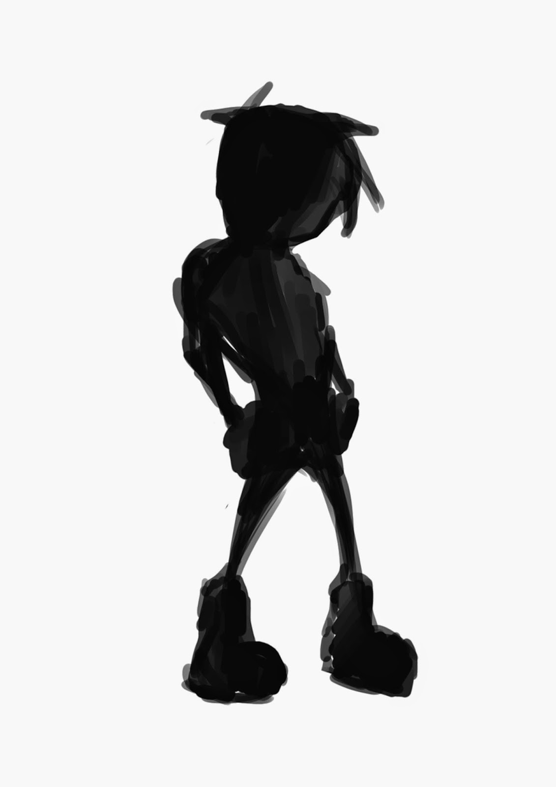
Coming up with what my character would look like was actually the first thing I did. Playing the game 'Limbo' was when I decided to make my whole game with shadows (only a lot more colorful shadows) so I started of drawing my own version of that games main character and developed him from there. 


1st


Since I couldn't just copy 'Limbo' (I could but people would keep bringing it up) I started playing around with the style of my boy, whom I choose leave nameless for the duration of this project.


2nd

3rd


I liked the 3rd guy more but I started thinking that the plain black look was a lil boring, or at least too grim. So my solution was to add something that was a different color, like a belt or a scarf, something that flowed when my character ran. I liked how the scarf looked so I never bothered with the belt.


4th


No.3 guy with a scarf looked good so I was gonna stick with him, only he seemed too old for my liking, so my next brilliant idea was to draw him again only younger. In retrospect it seems like I started out with my own concept of 'Limbo' and ended up with a different "own concept of 'Limbo'" but at least I can justify how I ended up there.


5th


Monday, 10 November 2014


Final Project


Well, I made it through to the final year of university, and to the final major project of said year. Thus begins the slow trudge towards what will no doubt be immeasurable success and universal appraisal. First though I need to make the damn thing.

 Since I'm going at this project solo I decided to make it a 2D Platformer, It's a good genre for soloists and much simpler to design than a 3D project. I'm going to be drawing all my assets instead of modelling them so I made a choice early on not to draw any in detail and instead make them all block colors. It's a lot more time efficient, plus I really like the storybook(ish) effect of it all. 


Character Concept (Slightly Shaded)

Character concept (Plain Color)

Boss Concept
 How much detail I should add to an image is something I'm still debating. Slightly shaded drawings like the balloon would be look good if was used to say, give the impression of something illuminated, such as moonlight etc.. on the other hand though that effect could be easily achieved in unity without having to carefully shade my assets. While I don't think I'm going to include details like eyes for my protagonist, I'm strongly considering keeping those details for the Boss character. One reason being that if everything is ultimately just a plain color, then having a character with lines and eyes will elevate it in importance, and the other reason that this character needs to be clearly visual if something to be avoided.      
  

1st Concept

What assets might look like if not silhouettes

Night Trees

Night Ruins
  

 The first experiment wasn't quite what I was looking for, the colors clash with each other too much, so i figured it would be best if the colors reflect the time of day. If it was midday then the colors would be bright, if it was night then they would be darker etc. The few drawings of foreground/terrain set at night worked better in my eyes due to the color pallet being a lot more consistent in this regard. It also lead me to m final concept below which was sort of a mash up of all the drawings above.      

My goal as of right now is to make 3 levels, one at dusk, one at night and one at daybreak. I probably wont be able to make all three of them but it's a start. The trees looked pretty good as silhouettes so I've decided the majority of the game will take place in a forested area, along with the decaying ruins of once great civilization to add some variety.

 I haven't thought of a name yet so for now I'm calling it something kinda pretentious like..


Final Concept
  

Saturday, 17 August 2013


Dull Day


I saw this Painting in a magazine. It was of a girl drawing these animals that came to life and flew out of their page and it stuck on my mind for quite a while after. Couple of days latter I was stuck at home sick on a particularly sunny day. Tired of listening to screams of joy from children playing and the wafting smell of BBQs from outside my window, I figured I'd try out my own version of the Painting I'd seen. My cat (Diego) sorta happened to be there so I drew him as well.

Monday, 8 July 2013


Sea Creature


Phase1
Phase2

Phase3


Water has got to be one of the hardest things to draw I feel, but creatures that live in water are pretty fun to draw. Although the whale like eel thing was fairly simple to draw, painting it was a little tougher trying to blend various shades of blue. The waves at the end were drawing using that really famous Japanese painting as reference and are mostly there just so I didn't have to draw the rest of the body.

3D Modal


Pic1


Pic2


Pic3

This being the first "living" thing I've created in 3D max I wasn't exactly sure where to begin, but eventually I managed to shape and reshape a cylinder in to something that resembled my painting and applied a modifier to smooth it out.   


Alien Landscape


Rocky

Colored

Shaded Rocky

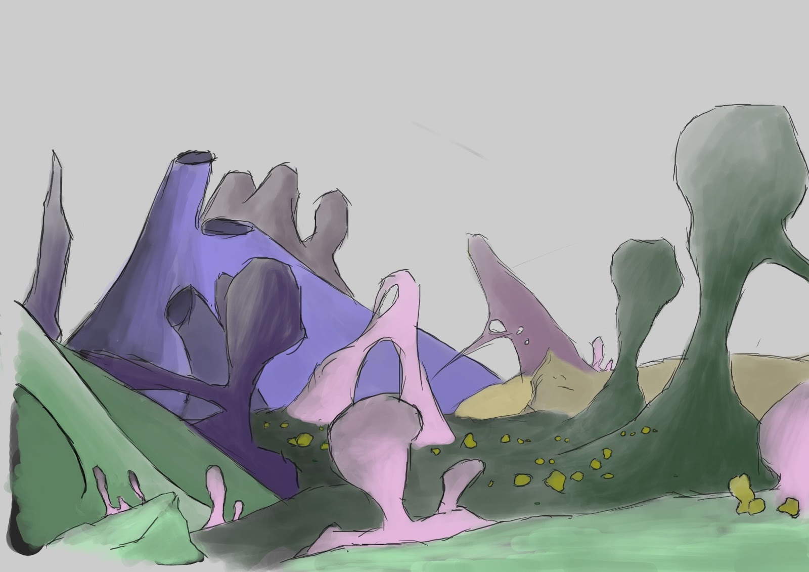
It was only after I was half way through the first drawing that I began to question how exactly I'm supposed to draw extra terrestrial terrain. After all I've never been to an alien planet and have no idea how geometry would be formed in an atmosphere other than Earth's, so potentially I could of just drawn a bunch of upside down ice-cream cones in the middle of a rock that resembled James Cameron and it would have been just as plausible. However I suppose that would have been a little too Alien, so instead I took reference from already existing mountain landscapes (Earthen origin) and just made the terrain more pointed or curvy.